E-Newsletter Dos and Don’ts
 E-newsletters are a powerful way to communicate with your target audience. They help build affinity for your brand and can impact travelers at every stage of the sales funnel. Most importantly, these recipients are people who have raised their hand to say, “Yes, I’m interested.” So, you have a special obligation to deliver valuable and compelling content. To help you do that, we’re running down our list of e-newsletter dos and don’ts.
DO…

Pique interest
Open the mail app on your phone right now. Do you SEE all of those messages competing for your attention?!? Everyone in your database is dealing with the same bombardment. Make it impossible for them to delete your e-newsletter with an irresistible subject line. Even better? Conduct A/B testing so you land on the subject line that inspires the most opens.
Make it relevant
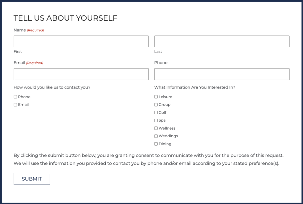
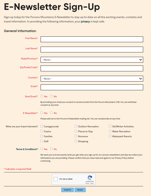
Opt-in for your e-newsletter should collect enough data to gain a clear picture of your audience, but not so much that it discourages form completion. We recommend including check-boxes for interests – as optional fields, of course – so you can deliver more personalized communications to subscribers.
Here’s what that could look like for a hotel/resort:

And here’s what that could look like for a DMO:

Even if you don’t have access to data that allows you to segment your database by interest, you should strive to share content that fulfills what travelers need and want to know. This can be determined by what content performs best on your website.
Write conversationally
You don’t want to come across as pushing visitation or heads-in-beds. As you sit at the keyboard to draft your e-newsletter, visualize someone specific and write what you think would excite them about your property or destination. Your messaging, tone and style should read more like a recommendation from a friend than a purely promotional pitch.
Build a mobile-friendly design
According to software company Mailbutler, 41% of email views are on mobile devices, 39% on computers and the remaining 20% on tablets or other digital devices. We believe that the 41% statistic will only go up. That’s why it’s critical for your e-newsletter design to be optimized for mobile devices.
Keep it snackable
As mobile device usage surges, attention spans drop to new lows. So, even people who love to read will likely delete a long and rambling e-newsletter. You want to give your subscribers just enough information to motivate them to click that button for a deeper dive into your website. Check out this issue of the NJ Division of Travel and Tourism e-newsletter for an example of high-performing, low-word-count content.
Inspire action
Whether you want your e-newsletter readers to visit your site for more details, download a travel guide or book a stay package, be clear about the action you want them to take and make it easy for them to follow through.
Review before sending
Before your e-newsletter hits a single inbox, it should already have been carefully proofread (by a detail-oriented person who is NOT the author – it’s too easy for the copywriter to read into it what they meant to say). All links and tracking information should also be thoroughly reviewed and confirmed for accuracy to ensure readers get to the correct content and your e-newsletter analytics are solid.
Maintain a consistent schedule
If you plan to publish monthly, deploy your e-newsletter about the same time (e.g. the second Tuesday) of each month. Weekly? Take the same approach (e.g., Wednesday mornings). Your subscribers will come to expect your organization’s name to pop up in their email on those days and act accordingly.
Allow unsubscribes
Every issue should include an easy-to-find, easy-to-use unsubscribe link. And don’t take those opt-outs personally. People only have so much time in the day to consume content, and you only want to maintain engaged subscribers in your database.
Track results
Knowledge is power! When you know exactly what subject line generated the most opens and which features earned the most clicks, you gain valuable insights into what your subscribers find interesting (and not-so-interesting). Use that intelligence to guide content for future issues.
DON’T…

Throw away the subject line
It’s the difference between an open and a delete. Other blogs attempt to give a rigid scientific formula, complete with mandated character counts, to follow. We think of subject line writing much more as an art and take a fresh approach to each and every issue.
Go overboard
Too much copy, an excessive number of links and an abundance of images can overwhelm your subscribers. Keep your e-newsletter messaging concise and the design clean for improved readability and a pleasing aesthetic.
Get too salesy
This is not an ad. Don’t make it look or sound like one. Remember, the goal here is to make your e-newsletter feel like a recommendation from a friend.
Send to anyone who hasn’t opted in
Consent is key. Governments are serious about protecting their citizen’s privacy. America has the CAN-SPAM Act, and Europe has GDPR. And you definitely want to remain in compliance with these regulations.
Actually, we have one more thing to add to the list. Do… partner with Dana Communications to create an e-newsletter that boosts your bottom line. Contact Lynn Kaniper at 609.466.9187 ext. 117 or lkaniper@danacommunications.com today to opt-in for impressive, measurable results.